
In today’s digital age, where online presence is a must, the question echoing through the corridors of successful business strategies is clear: why is responsive web design important? It’s not just a trend but a fundamental necessity, especially because users are transitioning between devices. Let’s look at the crucial reasons why businesses need to adopt a responsive design to have any chance of succeeding in their digital endeavors.
What Is Responsive Web Design?
Responsive web design is a dynamic approach to crafting websites that ensures an optimal user experience across various devices and screen sizes. In an era where digital interactions occur on diverse platforms, from desktop computers to smartphones and tablets, responsive design is the key to adaptability. Combining flexible grids, layouts, and images, sites seamlessly adjust their appearance and functionality based on the device being used.
The effect of a non-responsive website on mobile users can be profound. Users may find themselves needing to zoom in and out for content visibility, resulting in a poor user experience. Moreover, search engines penalize non-responsive sites, potentially harming your SEO ranking.

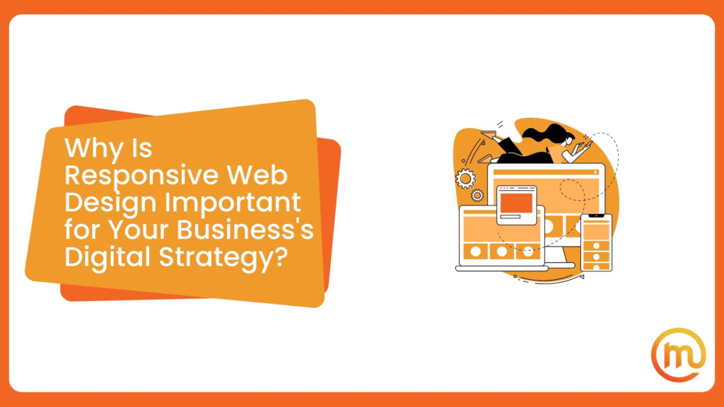
Why Is Responsive Web Design Important for Your Business’s Digital Strategy?
Responsive web design is essential for any business’s digital strategy. Why? Mainly because it ensures a top-notch user experience, regardless of the device used. It accommodates users on any screen size – and there are plenty of devices and sizes out and about.
With the growing prevalence of mobile browsing, this approach not only adapts to various screen sizes but also enhances brand consistency, improves organic rankings, boosts conversion rates, and contributes to a cohesive digital strategy for sustained success.
Once you understand what is the purpose of responsive web design, your audience will enjoy optimal viewing and interaction. Not to mention the website’s seamless adaptability to different screen sizes and orientations. This being said, let’s check what are the most important benefits besides overall satisfaction and usability.

Get the Enhanced User Experience Across Devices
What is a responsive web design and why is it important? Having the right answers to questions like these will only help you boost your online presence. It prioritizes adaptability, allowing websites to dynamically adjust their layout and content presentation based on the devices.
This adaptability is crucial in today’s diverse digital landscape, where users access websites from various devices such as smartphones, tablets, and desktops. By catering to this diversity, you’ll reduce bounce rates as users encounter a site optimized for their specific device, thus encouraging prolonged engagement.

Optimize Your Adaptability For Mobile Dominance
As of May 2023, more than 65% of worldwide website traffic originates from mobile devices. Since the start of 2017, mobile traffic has consistently remained at or near the 50% mark. This underscores the crucial significance of optimizing your site for both devices in the present digital landscape.
With the massive shift towards mobile browsing, emphasizing adaptability to its dominance has become a must. The escalating reliance on smartphones for online activities necessitates a valid approach to cater to mobile users effectively.
This adaptability is not merely a trend but a strategic imperative, integral to the overall success of digital strategies. Businesses that prioritize mobile responsiveness capitalize on the preferences of an audience that prefers this kind of screen, positioning themselves for sustained relevance and success in the digital realm.
The Importance of Responsive Web Design and Advanced Mobile-Friendly Strategies
These designs not only cater to the preferences of mobile users but also address the diverse landscape of devices, providing consistent and optimized experiences. There are two approaches to providing a mobile-friendly experience. The first method, known as Dynamic Serving, utilizes a single URL while employing distinct HTML and CSS code. Pages are designed to identify the device on which they are being viewed, and accordingly, they deliver the appropriate code.
The alternative approach involves the creation of a distinct mobile site. When users access the website using a mobile device, they are directed to a separate URL specifically designed for mobile use.

Enjoy the Consistent Brand Image Across Platforms
When you adhere to responsive designs and visual identity, regardless of the device used, businesses establish a cohesive brand presence. This uniformity reinforces brand recognition and strengthens the connection users have with the brand. Whether accessed on a desktop, tablet, or smartphone, a site that maintains consistent branding elements ensures that users enjoy an easy-to-use and recognizable interface. This harmonization contributes to a positive perception, fostering trust and loyalty.
The Connection Between Brand Consistency and Long-Term Customer Relationships
Brand consistency is the linchpin for building long-term customer relationships within the digital landscape. A uniform brand presentation goes beyond visual aesthetics and instills trust. Users encountering a familiar and consistent brand identity across various platforms feel a sense of reliability and authenticity.
This connection forms the foundation for establishing lasting relationships with customers. As users consistently interact with a brand that maintains a cohesive presence, they are more likely to develop a sense of loyalty, resulting in sustained engagement and advocacy over time.

Provide a Better Customer Experience With Optimal Website Loading
Enhancing user experience is crucial for website owners, as a positive impression can significantly influence visitors to return. When users access a site on a mobile device, a slow-loading site or images with inadequate resolution can project an unprofessional image for the company. This lack of professionalism can discourage potential customers.
However, with responsive design, which prioritizes an improved user experience, businesses can boost confidence in visitors. Without the need for zooming and scrolling, content becomes easily accessible, leading to quicker navigation and leaving a positive overall impression. Responsive web design is not just a technical enhancement. It’s a strategic tool that enables seamless and professional interaction, ultimately encouraging users to explore and engage with a company’s online presence.
Improved Conversion Rates and Lower Bounce Rate
The symbiotic relationship between responsive website designs and conversion rates is a linchpin for online success. A top-notch design ensures that the user experience remains seamless across devices, reducing friction in the customer journey. With a consistent and easy-to-use interface, these websites foster positive interactions, which, in turn, lead to increased customer satisfaction.
Satisfied users are more likely to convert into customers, whether through a purchase, sign-up, or other desired actions. This positive experience directly correlates with improved conversion rates. Beyond individual transactions, the cumulative impact on customer satisfaction plays an important role in the overall success of a business.

Experience the Easy Maintenance and Save Much-Needed Time
If you’re still wondering why responsive web design is important, well, you surely must think of its easy maintenance. It offers a practical solution for businesses, particularly smaller ones, that face time constraints in updating or refreshing their website’s appearance.
Instead of relying on hiring a designer for every aspect of your website, responsive design empowers you to make changes swiftly and easily on your own. The simplicity of managing just one website extends beyond design updates. It streamlines other aspects of marketing as well, eliminating the need to decide whether to link the mobile or desktop site to social media updates.
Gain Better Analytics and Make Informed Decisions
Responsive web design not only makes your site look good but also brings some fantastic perks in terms of analytics. For example, you can effortlessly track how your website performs on all sorts of devices, from smartphones to desktops.
This means you get a treasure trove of marketing trends and data about user behavior across various platforms, screen sizes, and orientations. Armed with these insights, you can make smart, data-driven decisions to amp up user experience and ramp up those conversions.

Keep Up With the Competition
In today’s fast-paced business world, having a responsive website is a game-changer. It’s not just about keeping up, it’s about gaining a competitive edge that can set you apart from the competition. Think of it as your secret weapon for success. And since it’s not just a trend, but a strategic necessity, it offers a smooth user experience that not only attracts visitors but keeps them around longer.
As a result, it boosts your chances of turning clicks into conversions and sales. Without it, you risk falling behind competitors who are already reaping the benefits. So, in the race for business success, a responsive website is your go-to ally, ensuring you stay ahead and make a lasting impact in the dynamic digital marketplace.

Be Cost-Effective and Top-Notch Experience
Responsive web design isn’t just a smart choice for providing a seamless experience. It’s also a budget-friendly one. Maintaining separate sites for mobile and non-mobile users can build up expenses really quickly.
With responsive design, you only need to invest in a single site design that caters to everyone and every device. This approach is all about getting the most bang for your buck, making it a practical and economical option for businesses looking to optimize their online presence.
Ensure Search Engine Optimization (SEO) for Better Visibility
Responsive website designs significantly impact search engine optimization and visibility. As search engines prioritize mobile-friendly sites, responsiveness becomes crucial for optimizing experience, reducing bounce rates, and improving SEO metrics. Although it takes time, a responsive site is key to achieving higher search engine rankings, making it essential for enhancing online visibility.

Explore Some of the Best Practices for Achieving a Responsive Web Design
After you see how a responsive design can actually benefit your business, there’s not much left to do. So, here are some of the best practices you can implement for building a website that plays nice on all devices:
- Embrace grids over pixels and inches – Move away from traditional metrics to create a more flexible and dynamic layout.
- Utilize media queries – Adjust the layout based on the screen size, ensuring a consistent user experience.
- Optimize images for speed – Improve loading times by optimizing images, a crucial step for a responsive design.
- Prioritize a mobile-first approach – Ensure your website is optimized for mobile devices, catering to the growing mobile user base.
- Implement responsive typography – Guarantee legibility across all devices by using responsive typography.
- Thorough testing – Test your website rigorously on various devices and screen sizes to iron out any compatibility issues.
- Leverage responsive frameworks – Speed up the development process by using responsive frameworks that streamline design.
- Opt for scalable vector graphics (SVGs) – Choose scalable vector graphics over raster images for better adaptability.
- Mindful element placement – Consider the placement of elements on the page for an optimal and user-friendly experience.
- Flexible grid system – Embrace a flexible grid system that adapts seamlessly to different screen sizes, adding that extra layer of responsiveness.
Should You Do Responsive Design on Your Own?
Considering whether to tackle responsive design on your own? Partnering with a top-notch marketing agency can be the game-changer your business needs for a resounding success. Crafting a responsive design requires a blend of technical expertise, creative vibes, and a deep understanding of what makes users stay.
You can forget the headache of figuring out grids, media queries, and image optimization because they’ve got it down to an art. Also, your website will connect with your audience in ways you never thought possible. So, it’s pretty clear that you should find a reputable agency with an array of services that will propel your site to heights you didn’t know existed.

Increase Website Impact Through Responsive Design With Made Online
Responsive design is not just a trend – it is a strategic necessity that continues to define and influence the way businesses connect with their audience in this fast-paced digital era. So, you don’t need to think about whether you should embrace this approach and invest wisely – your online presence surely will thrive in the ever-evolving digital ecosystem.
As businesses navigate the ever-evolving digital landscape, the imperative to prioritize responsive designs becomes even more apparent. That’s why you should opt to collaborate with not only the best SEO agency but also with the team that has it all together! Contact Made Online and experience the ease of digital presence.
